The Packaging Shelf Is the New Feed: Why Brands Are Designing Boxes for the Algorithm
- PAG

- Jul 2, 2025
- 3 min read

A Trend Desk on brands turning their products pretty for the digital show.

Remember when packaging was something you ripped off and tossed without a second thought? And if it were a little functional, you'd keep it for never to use. Ah, all those beautiful dust grabbers.
Today, your box isn’t just a box—it’s a content strategy. And I say content strategy because it is doing so much more than simply holding the product in place. It's performing.
And I really love a good show.
Honestly? Most days, I’m less interested in what’s inside than in watching the whole thing overperform on some influencer’s beautiful face. The crisp folds, the hidden wink, the little drama of it all.
Packaging is an unboxing moment designed to end up on Reels. A reason for someone to tag your brand before they even try what’s inside.
It’s the backstage pass to an experience you’re about to share online. It’s the part that makes you feel something—excited, curious, you name it.
Because in 2025, the feed doesn’t start on your phone—it starts on the shelf, the countertop, the doorstep. The real world has become the staging ground for the algorithm. And if your packaging isn’t photogenic enough to be content, you’re already behind.
Call it what you want: shelf culture, unboxing theatre, IRL clickbait. Either way, brands are designing packaging to live longer than the product it actually holds.
Let's have a look.
Casa Bosques Chocolate
Often, their bars come wrapped in limited-edition artist collaborations—textured papers, abstract illustrations, and collectible prints. It’s a bar you almost don’t want to open because the wrapper feels like a mini gallery piece.
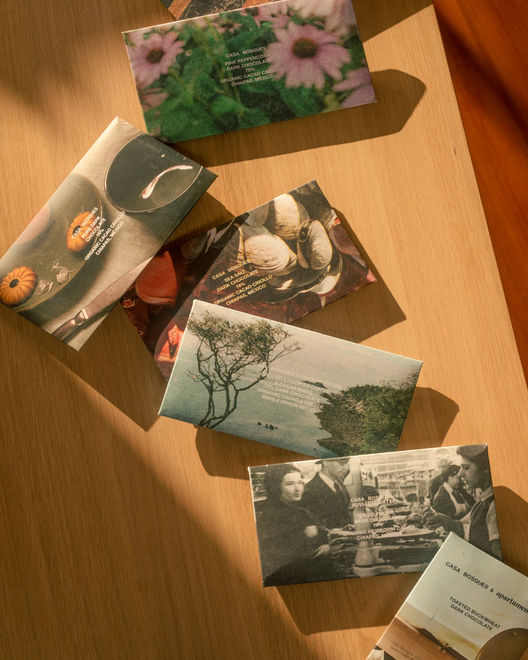
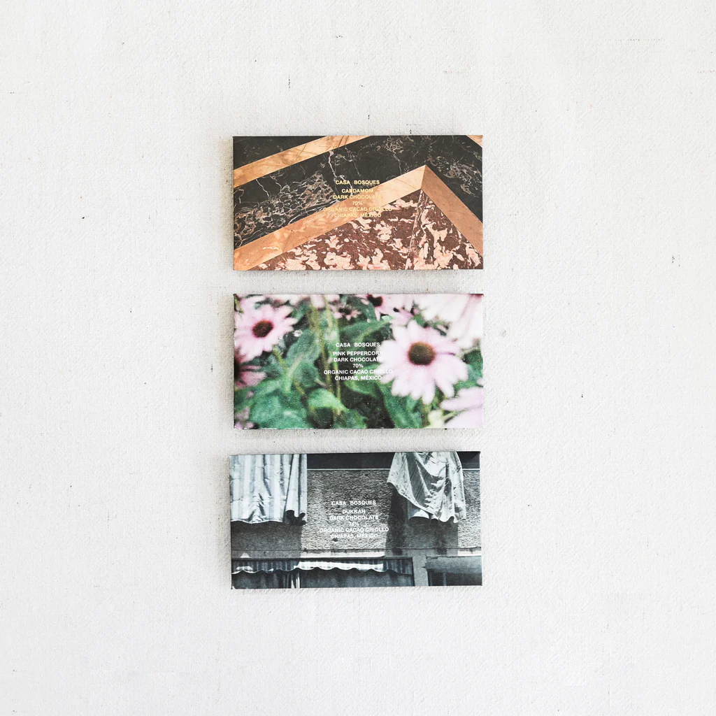
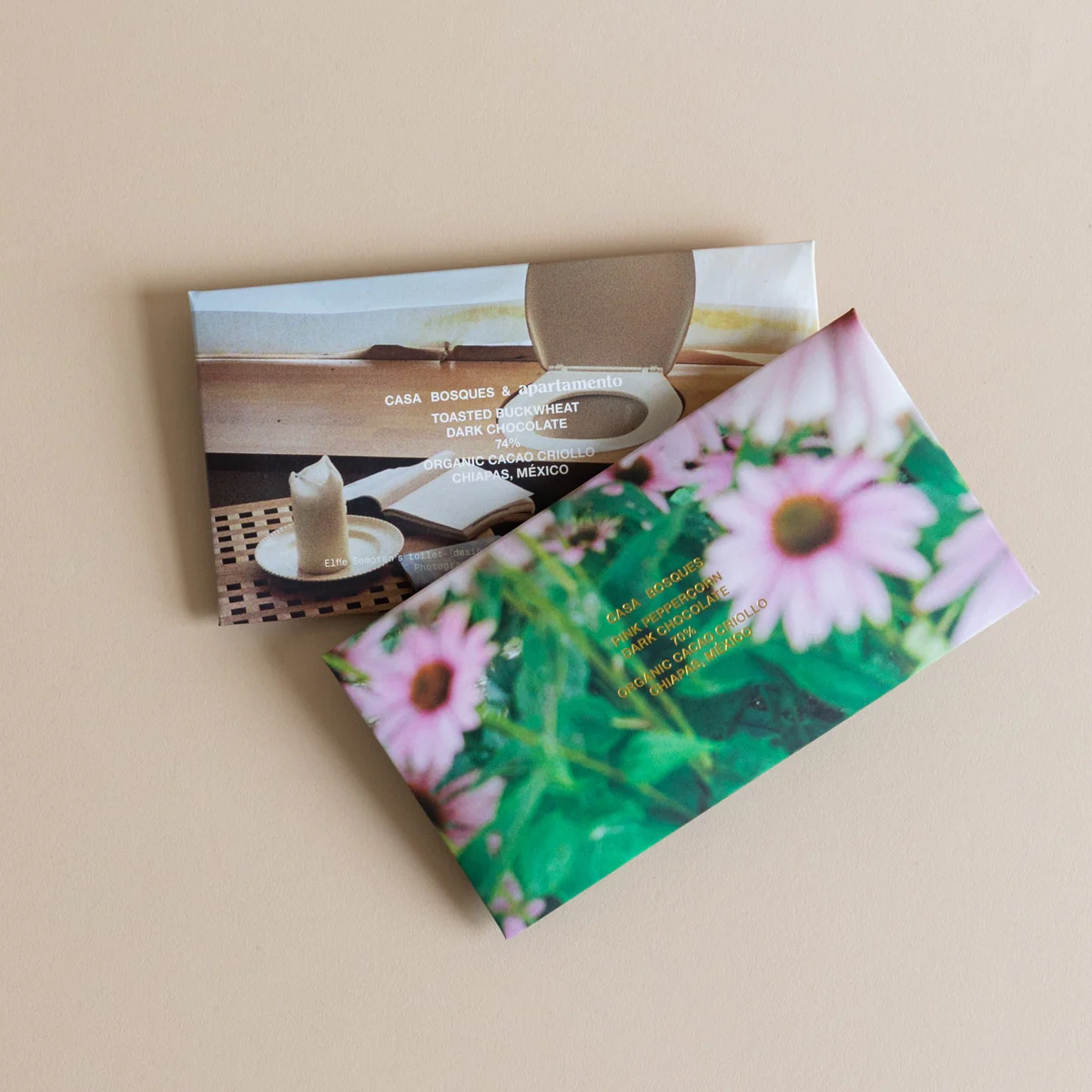
Why it’s smart:
Because it transforms something as everyday as a chocolate bar into a tiny art collectible.
Seed
Seed’s probiotics come in a refillable frosted green glass jar that feels like a luxury skincare vessel. Refills arrive in compostable packets.


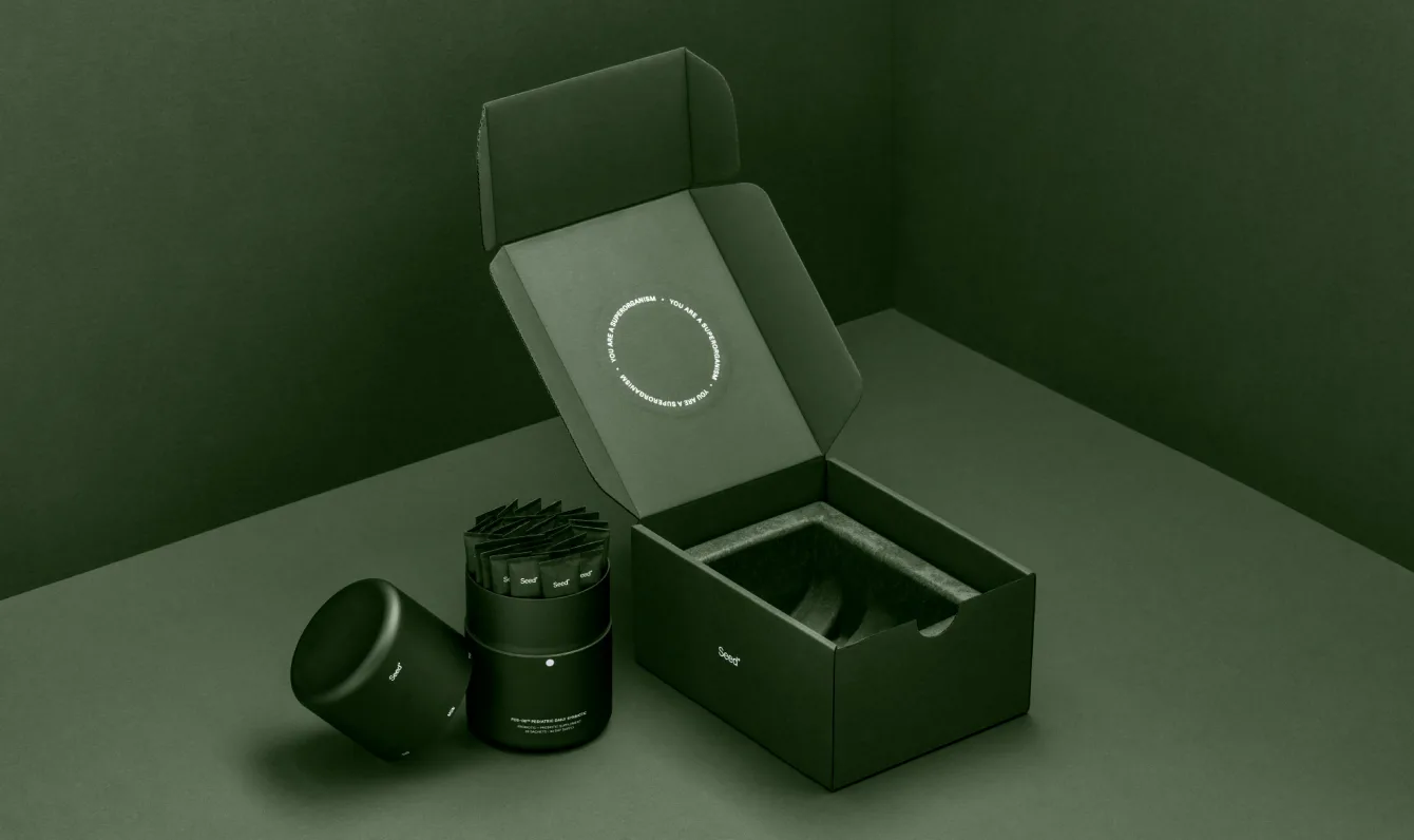
Why it’s smart:
The jar is too pretty to toss, creating a perpetual relationship with the brand.
Ghia
Ghia doesn’t just bottle aperitifs—it bottles a whole mood. Every release comes wrapped in matte cartons and glass that feel lifted from a 70s European bar cart: rich colors, crisp typography, and limited-edition labels designed by illustrators you’d happily frame. It’s the kind of packaging you don’t recycle. You rinse it out, repurpose it, and brag about it on your shelf like a souvenir from a trip you never took.
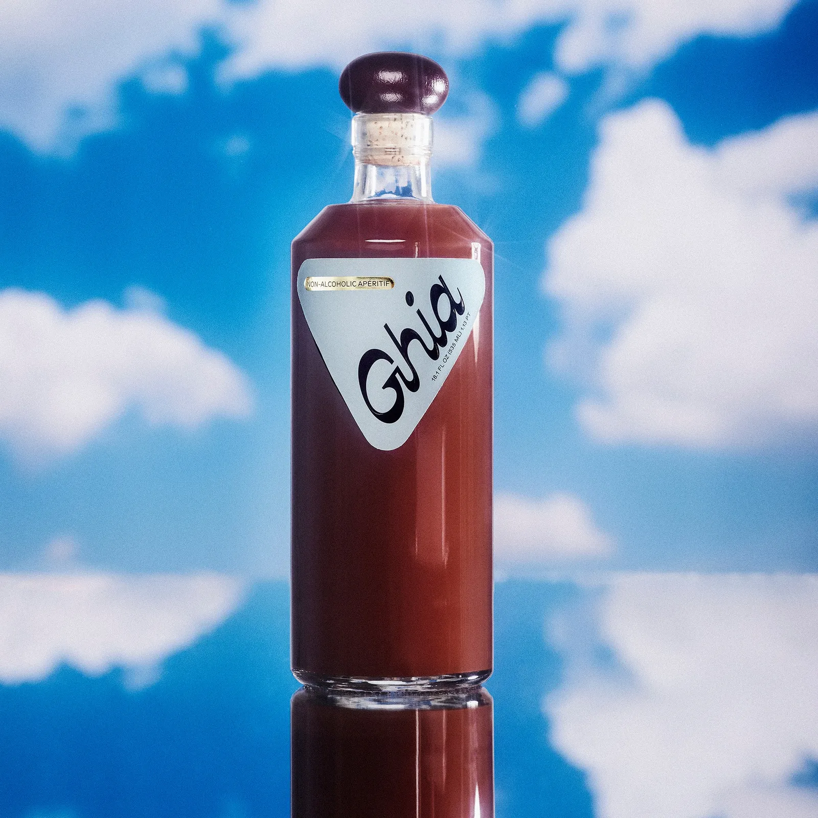


Why it works:
People collect the bottles as décor—lined up like a tiny bar cart. It’s packaging with a built-in afterlife.
Blueland
Blueland turned the most forgettable part of your home—cleaning products—into the star of your countertop. Their refillable glass bottles look like something you’d find in a high-design apothecary, not under your sink. Minimalist shapes, soft color-coding, and just enough typography to feel elevated but never precious.
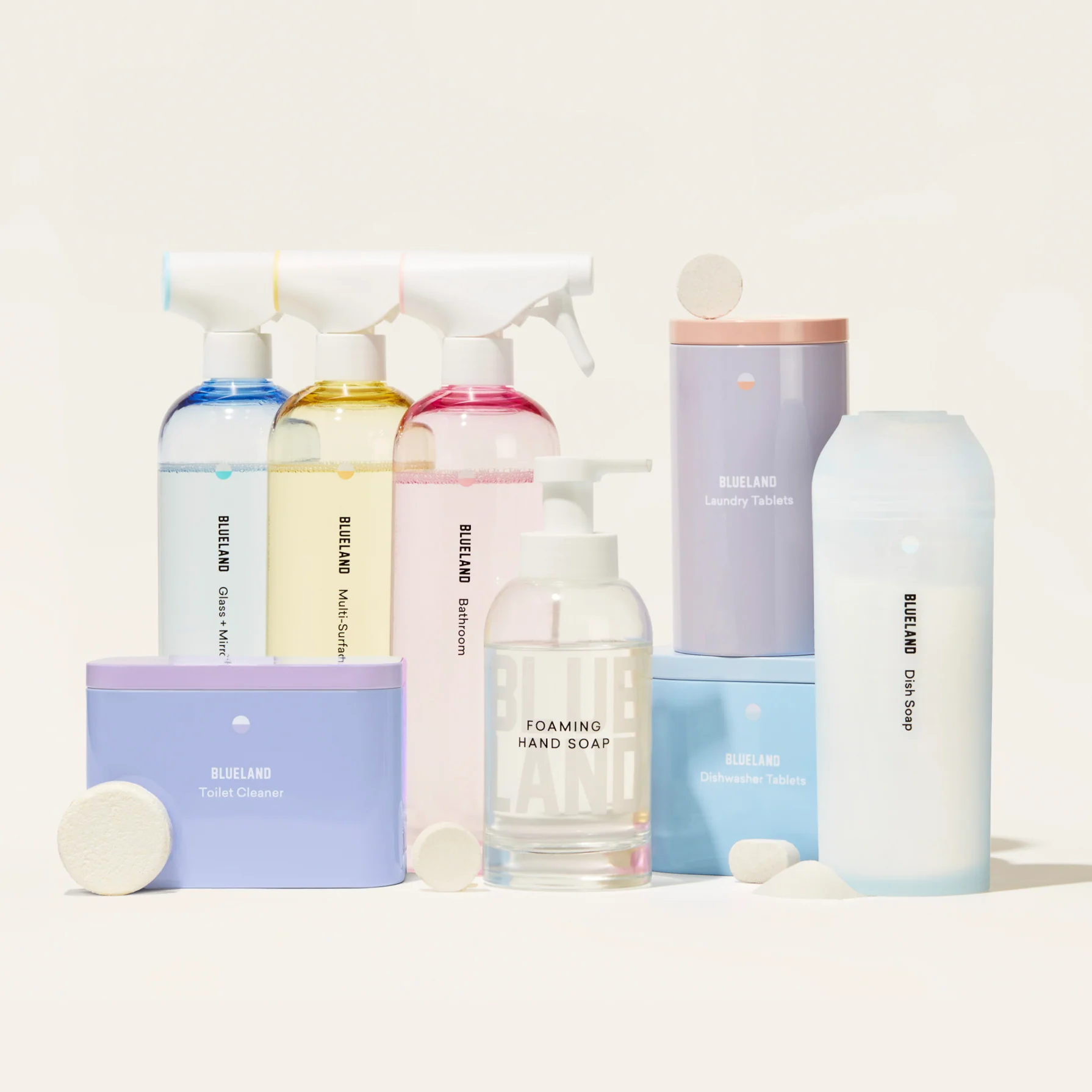
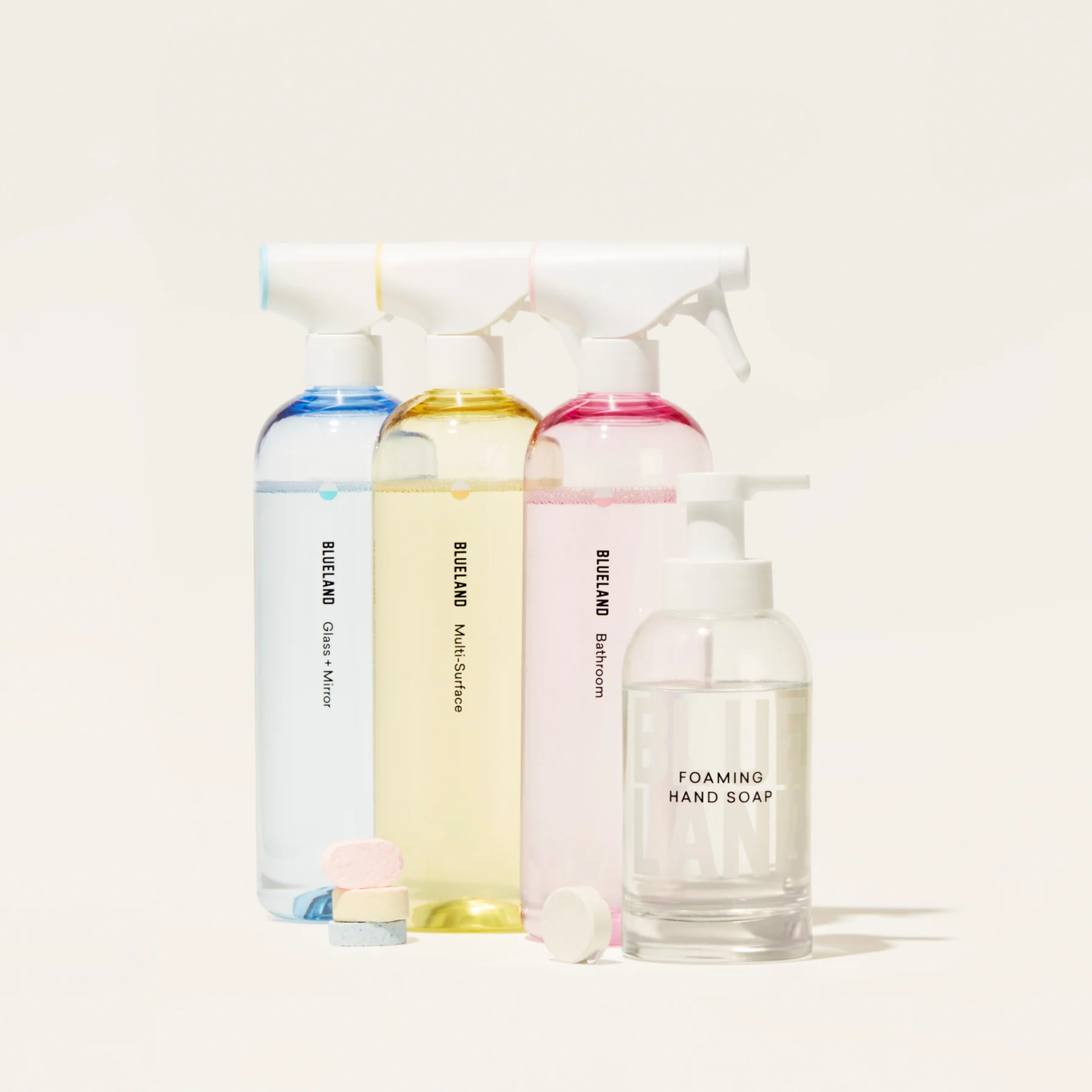
Why it works:
Because even if you don’t care about sustainability (though you should), you’ll care about how good these bottles look in your Reels. It’s cleaning rebranded as a lifestyle flex—and you’ll never buy a neon plastic jug again.
So here we are: in an era where the box outshines the thing inside it, and the packaging is the first act of the story you’ll share online. Maybe it’s a little performative. Maybe it’s the best kind of magic trick. Either way, the next time you rip open something that feels too pretty to toss, remember—good branding doesn’t end at the product. It starts with the little drama on your doorstep.
Until next time,
Thank you for spending time at the Trend Desk


Comments