The drink that makes sense in a world that doesn’t.

Scope:
Branding + Visual Identity
Production
Content Creation
Art Direction
Social Media
Credits:
Ivanka Urrea
Sussan Corrales
Tripa Bistro a Vin
Tripa isn’t your quiet, pressed-napkin bistro. It’s the kind of place where the wine is natural, the service is loud, and the energy spills over the table in the best way possible. Our job? Build a brand identity that didn’t soften that attitude — but amplified it.
This is Tripa. A bistro where nothing is hidden, everything is celebrated, and the joy is intentionally unpolished.
_gif.gif)

The challenge with this one was to honor the universal bistro codes — white plates, blue lines, heritage typography — while making the brand feel loud, fun, imperfect, and deliciously unfiltered.

So, we positioned Tripa as a “European Bistro Unrestrained” — classic bones, loud heart. A brand that borrows the language of traditional European hospitality, then lifts the volume with color, motion, and humor.
The voice? Confident, cheeky, charmingly chaotic — like a waiter who knows every natural wine on the menu and still calls you “baby.”

The logo bends into a continuous loop — a small, quiet metaphor for how Tripa works: no hard stops, no perfect symmetry, just a steady rhythm that keeps the night moving.A classic nod to the energy of the place.


Tap Photo
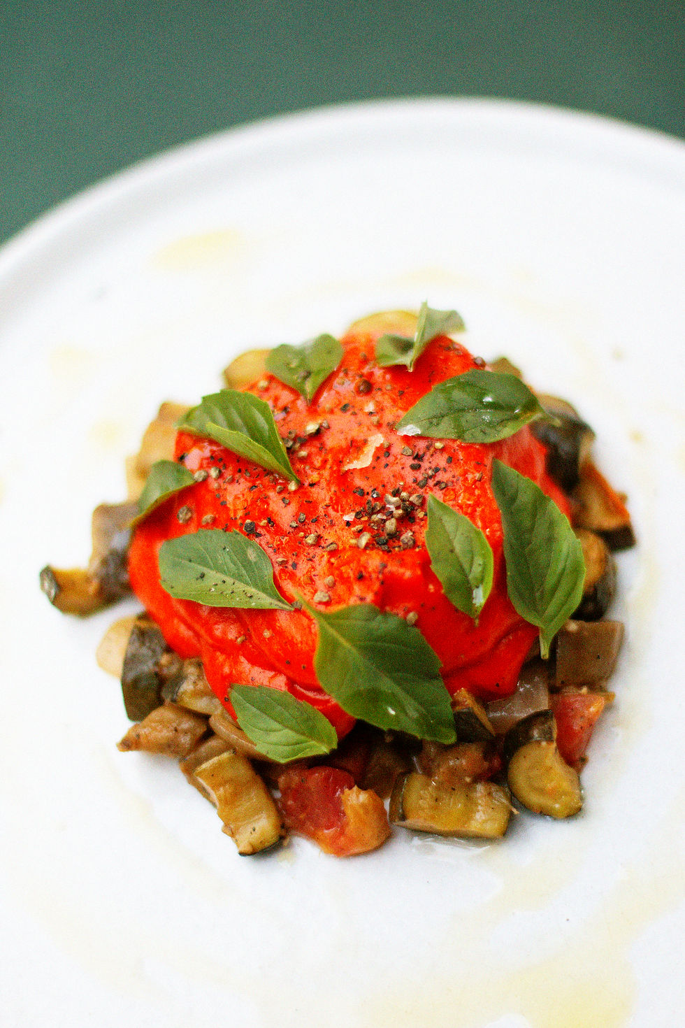
For content creation, we translated the identity into imagery with the same direct, high-energy feel: sharp contrasts, bold color moments, and compositions that capture Tripa’s unfiltered rhythm.
The visuals live in the same world as the brand — confident, immediate, and unmistakably alive.
.jpg)
.jpg)


.jpg)
.jpg)