Rebrands That Actually Worked – A deep dive into the best (and some open-to-discussion ones) brand refreshes we’ve seen lately.
- PAG

- Feb 28
- 3 min read
Updated: Apr 1

In the ever-evolving landscape of branding, companies often undertake rebranding initiatives to stay relevant, appeal to new audiences, or reflect strategic shifts. While some rebrands hit the mark, others miss spectacularly. Let’s explore some notable examples from recent years.
The Hits
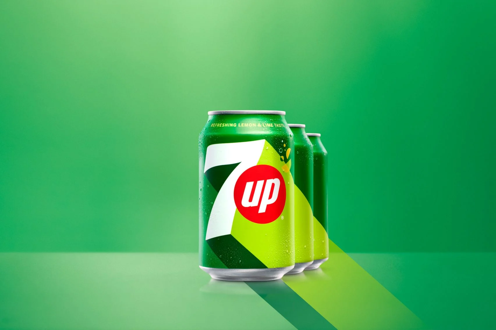
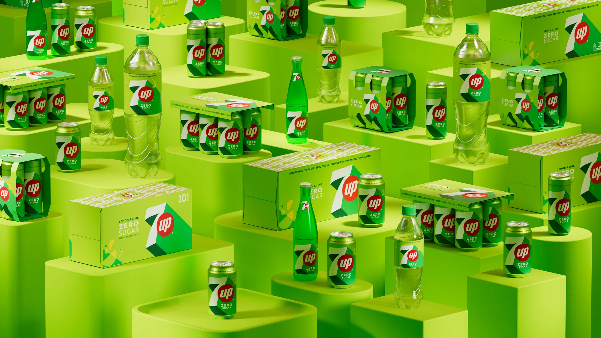
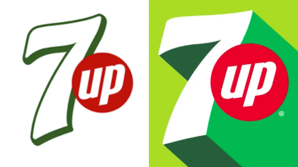
7UP: A Vibrant Revival
In 2023, 7UP unveiled a refreshed brand identity after seven years, aiming to infuse a sense of “uplifting” vibrancy into its image. The redesign featured a brighter green palette and a retro-inspired, three-dimensional “7” that resonated with both longtime fans and younger audiences. This modern yet nostalgic approach successfully rejuvenated the brand’s presence in the competitive soft drink market.
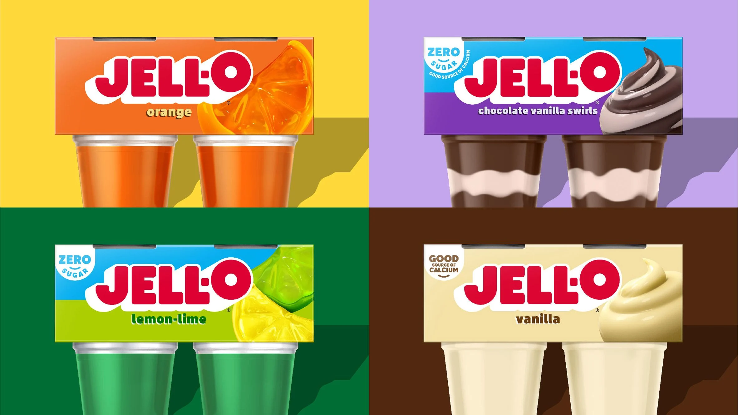
Jell-O: Modernizing Tradition
Jell-O, an iconic brand since 1845, embarked on a rebranding journey in 2023 to modernize its image while honoring its rich heritage. The updated design introduced subtle retro elements combined with contemporary aesthetics, resulting in packaging that appeals to both nostalgic consumers and new generations. This balance of tradition and modernity reinforced Jell-O’s position in the market.


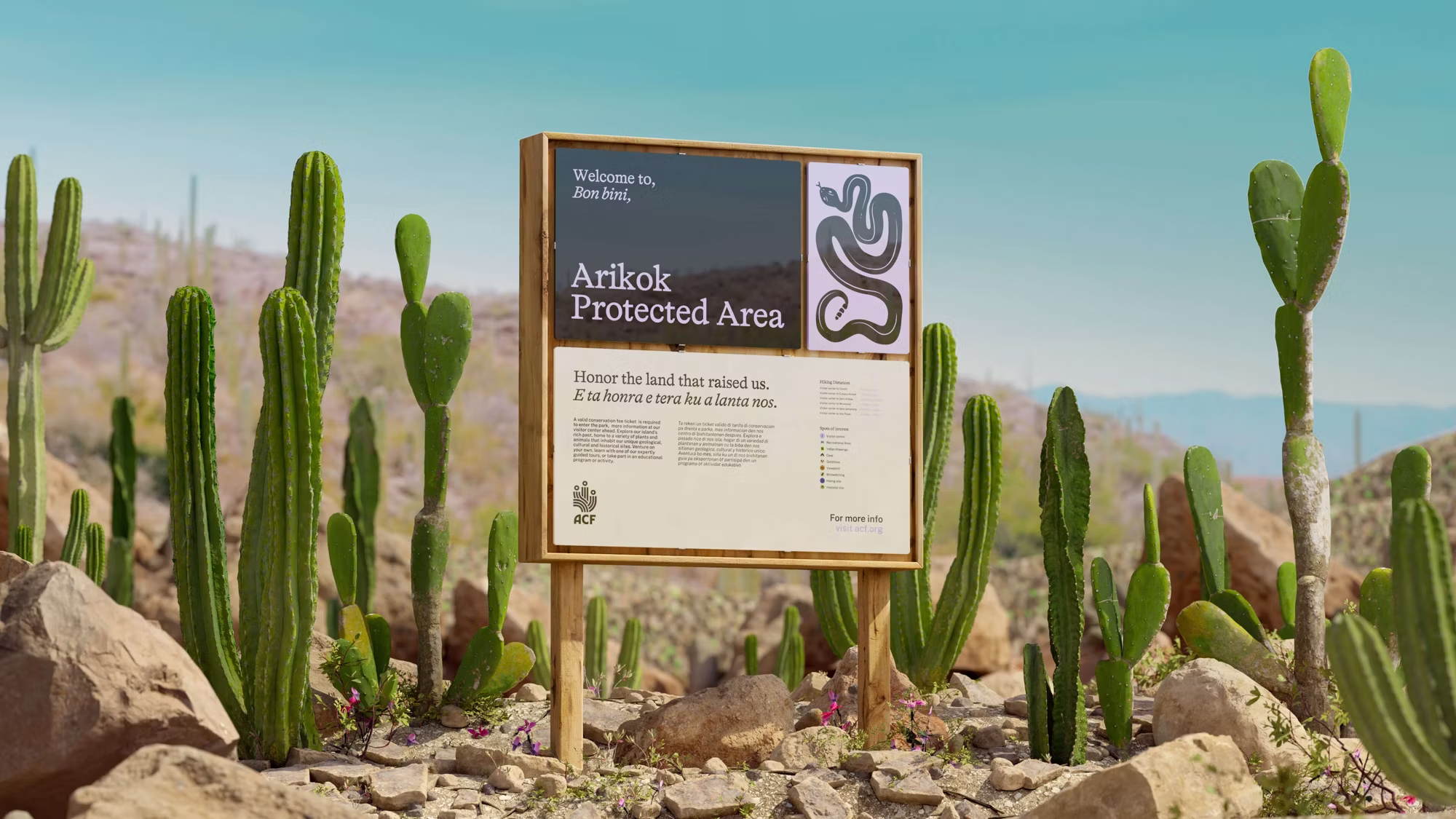
Aruba Conservation Foundation (ACF): Nature’s Voice
The Aruba Conservation Foundation underwent a transformative rebrand in May 2024, adopting a stylish new identity that reflects its commitment to nature preservation. The innovative logo design incorporates elements representing waves, cacti, and human figures, symbolizing the foundation’s dedication to marine and terrestrial conservation through collective action. This rebrand effectively communicates ACF’s mission and resonates with a broader audience.


Let's discuss.
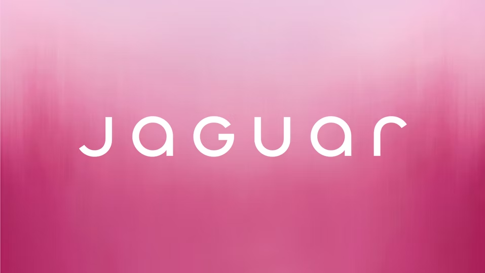
Jaguar: A Leap Too Far
In 2024, Jaguar introduced a rebrand that departed significantly from its traditional image, aiming to embrace a modern and inclusive identity. The new branding featured vibrant colors and androgynous figures, omitting the iconic leaping jaguar and even the cars themselves from its advertising. This drastic shift led to confusion and backlash, with critics arguing that it alienated loyal customers and strayed too far from the brand’s heritage.


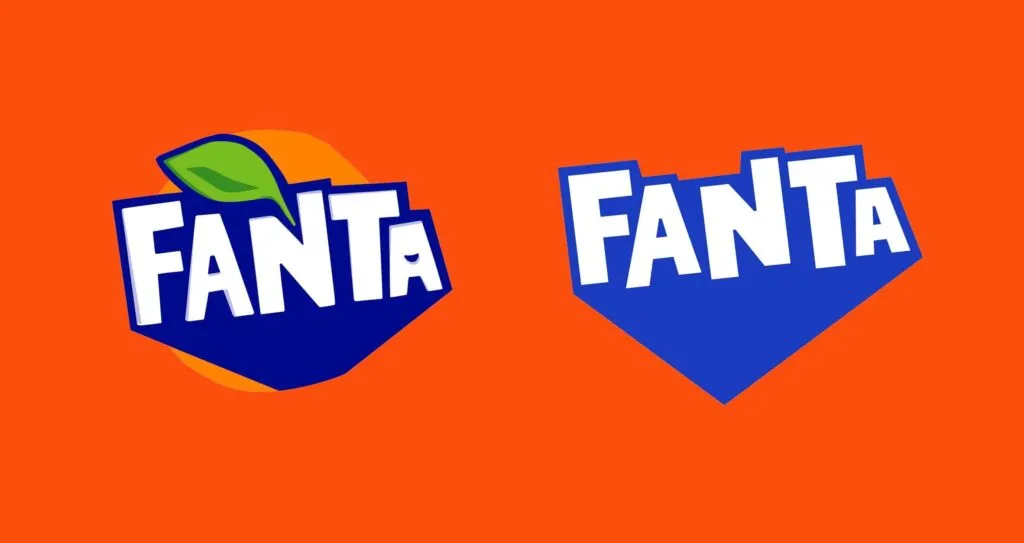
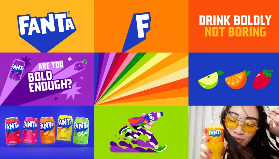
Fanta: Losing the Flavor
Fanta’s 2023 rebrand attempted to modernize its image by removing the classic orange and green colors, opting instead for a minimalist, single-color design. This change stripped away the playful and vibrant essence that consumers associated with the brand, resulting in a visual identity that felt bland and disconnected from Fanta’s fun-loving personality.
Whats our take?
Rebrands are like haircuts—you either walk out feeling like a whole new person, or you spend six months regretting every decision that led you there. The best ones? They don’t just slap on a new font and hope for the best. They get their audience. They know that a great rebrand isn’t about looking different—it’s about feeling right. Like Mountain Dew ditching the abbreviated “MTN” phase and stepping back into its full, unapologetic identity. Or W Hotels leaning into the fact that luxury travelers now want experiences, not just fancy furniture. These brands aren’t chasing trends; they’re shaping their own lane.
And then there’s the ones that miss—because nothing says brand crisis like a rebrand that confuses everyone (yes you, Fanta). The key difference? Confidence. The strongest rebrands aren’t afraid to own their personality. They’re playful, they’re sharp, and they know exactly who they’re talking to. If there’s one thing we’ve learned from these brand glow-ups, it’s this: a rebrand shouldn’t feel like a desperate makeover—it should feel like the best version of what was already there.
In the meantime, thank you for spending time at the Trend Desk.


Comentários